I’ve been testing several phone cleanup apps to speed up my device, but some feel helpful while others slow things down, spam me with notifications, or push confusing features. I can’t tell which UX patterns are genuinely good for users and which are just dark patterns or bloat. Can anyone break down what a good cleanup app user experience should look like, what to avoid, and how to evaluate these apps before trusting them?
Cleanup App (Phone Storage Cleaner) – honest take after a full weekend of use
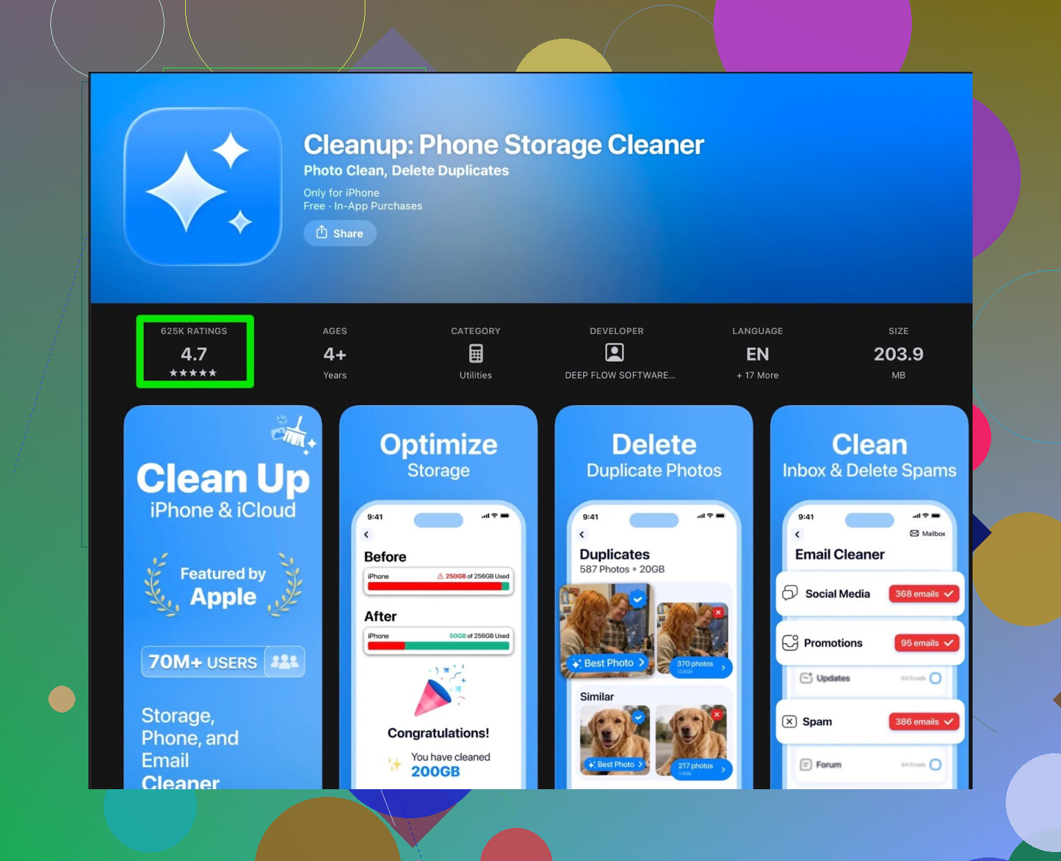
My iPhone storage hit that annoying point where every photo or app update triggered the “storage almost full” pop-up. I went hunting for a quick fix and ended up installing Cleanup App (Phone Storage Cleaner).
First launch looked decent. It scans for:
- Duplicate photos
- Similar shots (like 10 selfies with the same face)
- Screenshots
- Big videos
- Messy contacts (merging, cleaning, etc.)
On paper, it ticks the right boxes. I ran the scan, it found a ton of stuff, especially screenshots and slightly different versions of the same photo.
Then it started to drag.
After a few runs, the pattern was clear. The app keeps most of the real actions behind a paywall. The free tier turns into a sort of “preview mode”. It shows you what is wasting space, but when you try to clean in bulk you get blocked by:
- Subscription prompts
- Paywall popups
- Ads, lots of them
You can watch ads instead of paying, but it felt like every other step wanted me to stare at a full-screen ad. It breaks the rhythm completely. Do something, wait for ad. Do something else, ad. It gets old fast.
They also packed the app with stuff that did nothing for my storage problem. Fancy animations, some “secret vault” feature, and similar extras that look more like distractions than tools. I was there to make space, not set up a private gallery or watch UI effects.
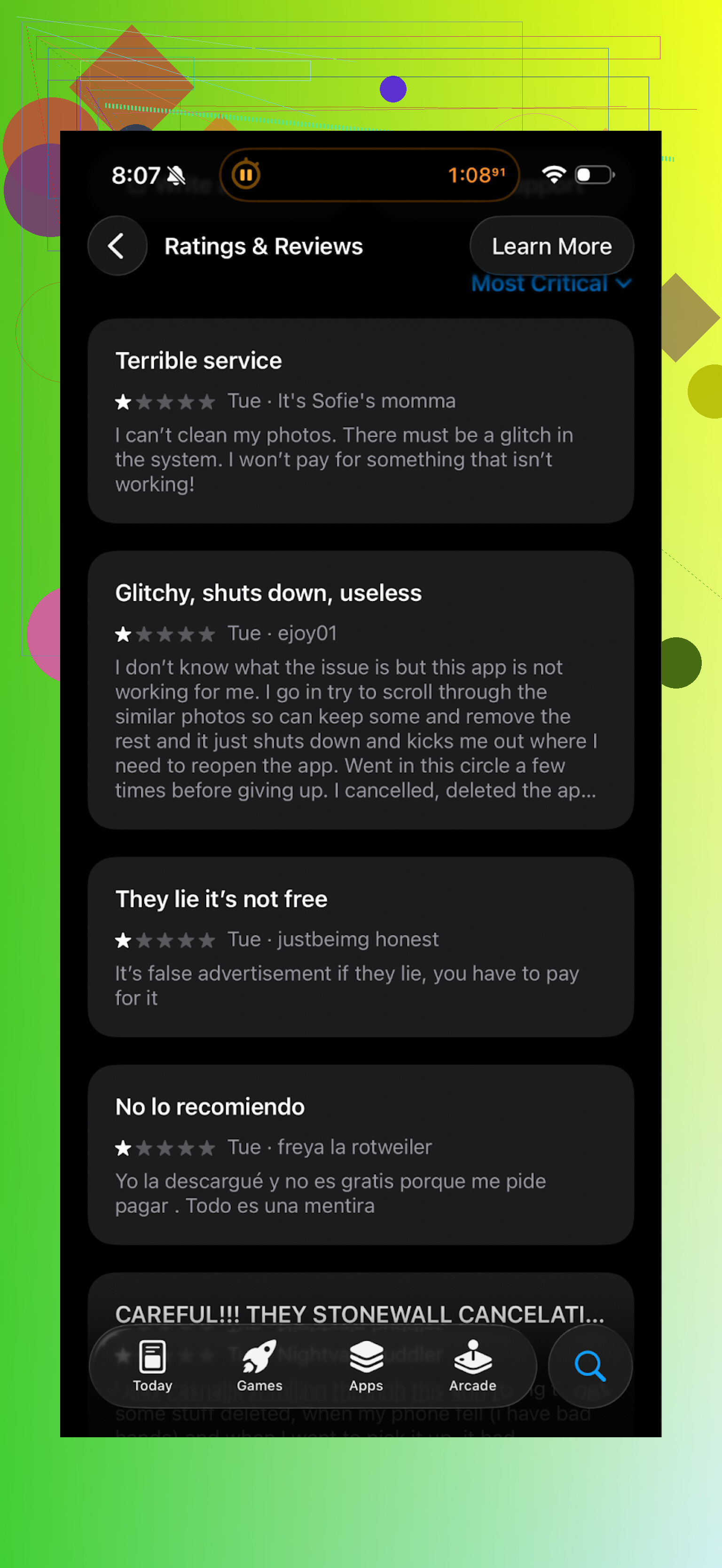
And it is not only me. Real user reviews say the same thing:
After a while I gave up and tried something else.
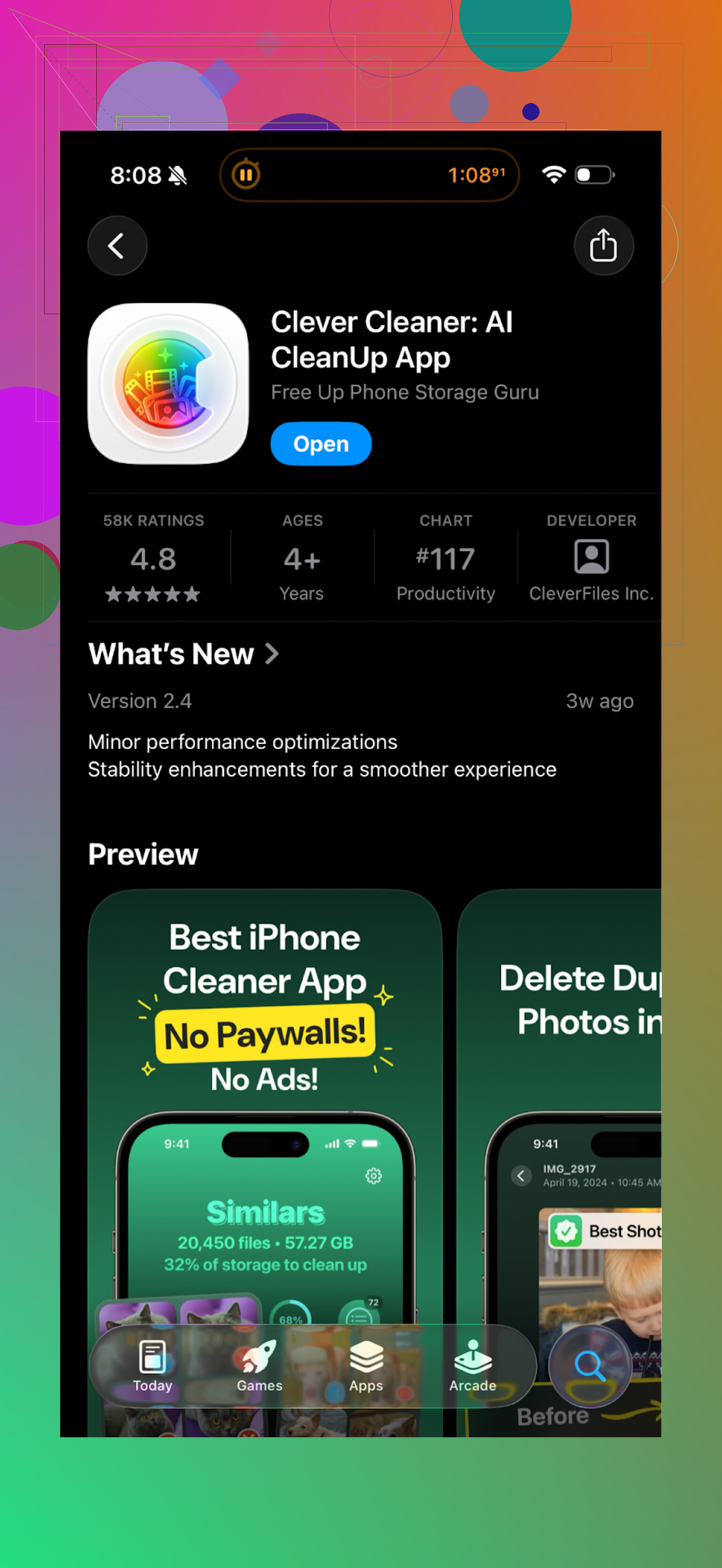
Switched to Clever Cleaner instead
I ended up installing Clever Cleaner and stuck with it:
This one felt different right away. The main thing for me, it did not shove a subscription in my face every few taps. I used it to:
- Scan for duplicate photos
- Remove similar images I did not need
- Find large files and big videos
- Clear old screenshots in bulk
The app went through my library fast and grouped things in a way that made sense. I could swipe through duplicates and mark what to remove without dealing with paywalls on every button.
No constant “upgrade now” pages, no long ad chains before every action. That alone made it easier to finish the cleanup in one sitting.
Here is a quick look at what I saw inside the app:
After one long clean session with Clever Cleaner, I freed up several gigabytes. Mostly from videos I forgot about and old screenshots. I checked Photos and Settings after, and the space numbers matched what the app reported, so it did not fake any “you saved X GB” stats.
Short version of my experience
Cleanup App (Phone Storage Cleaner):
- Works for scanning
- Shows you the junk
- Puts most useful cleaning behind a subscription or a heavy ad wall
- Has extra features that do not help much with storage
Clever Cleaner:
- Lets you do real cleanup without constant subscription pushes
- Handles duplicate photos, big files, screenshots in a clear way
- Felt quicker to move through and finish a full cleanup
If your goal is simple, free up storage without fighting a paywall every time you hit “delete”, I would lean toward Clever Cleaner.
Extra links if you want to see more detail or check it yourself
YouTube walkthrough of Clever Cleaner:

Clever Cleaner homepage:
Direct App Store link:
6 Likes
Short answer from my side: cleanup app UX is mostly bad, with a few decent outliers.
You already saw what @mikeappsreviewer wrote about paywalls and ads. I agree with most of that, but I do not think paywalls are always evil. The problem is when and how they show up.
Here is what I look for after testing a bunch of these.
Good UX patterns
-
Clear, single purpose
• Main screen focuses on storage, not VPN, battery, “secret vault”, horoscope, whatever.
• You see “Photos”, “Videos”, “Screenshots”, “Duplicates” in plain language.
• One tap to run a scan, no long intro flows. -
Real control over deletions
• Shows exact items before deletion, with thumbnails and size.
• Groups similar or duplicate photos in a way you understand, not some “smart” magic with no context.
• Easy “select all” plus quick way to unselect important stuff.
• Shows how much space you free before and after. -
Paywall that stays in its lane
• Free tier lets you complete at least one full cleanup without 20 interruptions.
• Subscription popup shows once at the right time, not every 2 taps.
• No fake scare tactics like “Critical! Phone in danger!” if you do not pay. -
Honest performance
• Scans fast and does not overheat your phone.
• No fake “you saved 10 GB!” when your phone only had 4 GB free total.
• Storage numbers match what you see in system Settings. -
Respect for your attention
• Notifications are rare and useful, like “Your storage is above 90% again.”
• No daily spam like “Clean now to avoid problems” or “Your system is at risk”.
Bad UX patterns
-
“Swiss army knife” home screen
• Storage cleaner, CPU cooler, VPN, antivirus, RAM booster, horoscope, all in one.
• Usually means more ads and trackers, less focus on storage. -
Constant ad walls
• Every tap triggers a 30 second ad.
• Forced video to unlock one tiny action.
• “Watch 3 ads to clean 50 photos.” That is where I uninstall. -
Confusing “AI” features
• “AI photo rating”, “beauty filter score”, etc, when you came for storage.
• Hides simple bulk delete behind fancy animation screens. -
Dark patterns around deletion
• “Smart clean” that does not show what it deletes in detail.
• Red warning icons to push you into quick actions without review.
• Tiny “view details” link, huge “Clean now” button.
Where I slightly disagree with @mikeappsreviewer
They are harsher on subscriptions than I am. I do not mind a subscription if:
• Free tier lets you try a full clean so you trust it.
• Paid tier adds speed, more scans, or automation, not basic delete.
• No nag screens every minute.
That said, most apps fail this and slide into dark patterns pretty fast.
Why Clever Cleaner App feels different
Not repeating their steps, but from a UX point of view:
• Focused feature set. Photo and file cleanup are front and center.
• Scans are fast and item lists are clear, so you do not feel lost.
• You do not get hammered with upgrade prompts while you are in the middle of deciding what to delete.
If you want something concrete to test patterns, install one “bad” cleaner you already tried and Clever Cleaner App side by side.
Do this quick comparison:
- Count how many taps from open to first full scan.
- Count how many ads or paywalls you see in 5 minutes.
- Check if the app shows every item before delete.
- Compare storage numbers in system Settings before and after.
If an app fails on 2 or 3, I drop it, no matter how pretty the UI looks.
Simple rule of thumb
• If you feel rushed, manipulated, or confused, uninstall.
• If you feel in control and finish a cleanup in one sitting without wanting to throw your phone, keep it.
Right now, Clever Cleaner App lands on the “keep it” side for me. Most others sit in the “nope” folder.
Short version: most cleanup apps kinda suck, a few are decent, and the UX patterns usually tell you which bucket they’re in within 3 minutes.
I’m mostly with @mikeappsreviewer and @nachtschatten, but I think they’re both slightly underplaying one thing: risk. Bad UX here is not just annoying. It can quietly nuke stuff you actually care about.
Stuff I watch out for that they didn’t really dig into:
-
How “aggressive” their defaults are
If the first big button is “Smart Clean” and it already auto‑selected thousands of items without asking you, that’s a red flag.
Good pattern: everything is unselected by default, and you opt in.
Bad pattern: auto selects “blurry / similar / unused” with tiny text saying what is about to get wiped. -
What happens on your second or third session
A lot of apps behave nicely once, then crank up the dark patterns later.- Session 1: smooth, minimal nags
- Session 3: “Critical! Your phone is at 5% performance!” like it suddenly discovered your device is dying
Good UX keeps the tone and friction the same over time. No escalation nonsense.
-
Transparency when “AI” is involved
I don’t hate “AI cleanup” in theory, but if it says “low quality photo” and gives you zero explanation why, that’s not smart, it’s lazy.
Decent pattern: explains why something is tagged (duplicate, almost duplicate, tiny resolution, shot from inside another app, etc.).
Terrible pattern: vague “unnecessary file” label and a giant “Clean” button. -
Storage math that actually checks out
Both of them touched this, but I’d push it harder:- If an app tells you that you “cleaned 8 GB” and Settings > General > iPhone Storage says you freed 1.1 GB, I uninstall on the spot.
Padding numbers to feel “impressive” is UX lying, not UX.
- If an app tells you that you “cleaned 8 GB” and Settings > General > iPhone Storage says you freed 1.1 GB, I uninstall on the spot.
-
Respect for system-level tools
A surprisingly rare good pattern: an app that reminds you “you can also use iOS / Android’s built‑in storage section for X and Y” instead of pretending it is the only solution on earth.
If an app is terrified you might touch system settings, I assume it knows it’s redundant.
Where I kind of disagree with both of them:
- They focus a lot on ads and paywalls (fair), but you can actually have a no‑ads, paid‑only app with bad UX too.
- Clean, minimalist interface ≠ good experience. Some of the worst cleaners I tried looked visually slick, but had super obscure labels like “Deep Boost” or “Junk Level 3” that tell you nothing.
What has actually worked well for me:
- I use the built‑in storage tools first. On iOS, “Review Large Attachments” and “Offload Unused Apps” do more than half the job.
- Then I bring in a dedicated cleaner only for the stuff the OS is clumsy at: duplicates, Look‑alike photos, and old random screenshots buried from years ago.
Clever Cleaner App fits that niche pretty well. Not magical, but:
- It focuses on photos, videos, screenshots and duplicates instead of pretending to fix your battery, CPU, aura, etc.
- It shows the items clearly before deletion, which solves that “did I just wipe an important album” anxiety.
- It did not spam me with fake system alerts or fake “phone in danger” warnings.
Is it perfect? No. I’d actually like more obvious “are you sure” confirmations for big bulk deletes, and a clearer explanation of its “similar photo” logic. But compared to the “Swiss army knife with horoscope” cleaners, the overall user experience is actually sane.
Personal rule of thumb that has saved me a lot of stress:
- If I’m confused for more than 30 seconds about what exactly will be deleted, I close the app.
- If I feel rushed by scary wording or timers, I never trust it with bulk actions.
- If the numbers do not match my system storage, I assume the stats are marketing.
So to your “good or bad” question:
- Most are bad UX because they mix dark patterns, fake urgency, and cluttered features.
- A few, like Clever Cleaner App, are actually decent when used alongside system tools, especially for photo / video cleanup.
If you try a new one, run this super quick sanity check:
- Open it and ignore the big “Smart Clean” button.
- Can you easily browse exact items, with clear sizes, before choosing?
- Do you see more than one “Clean now or be doomed” message?
- After deleting a small test batch, does Settings show about the same freed space?
If it flunks that, it’s not just bad UX, it’s not worth your data or your time.
Mostly good thoughts in this thread already, but I think the “cleanup apps are bad by default” stance is slightly too harsh.
From a UX perspective, you have three layers to judge:
- What the OS already gives you
- What the app claims to add
- How safely and transparently it lets you use that extra power
On 1:
Android and iOS already handle cache, offloading, and “large files” pretty decently. Anything that pretends to “boost RAM” or “cool CPU” is basically theater. Here I fully agree with @nachtschatten and @mikeappsreviewer: those features are mostly noise, and the UX is often just a skin over fake utility.
Where I slightly disagree with all three of you is on 2:
Photo and contact cleanup really are places where a third party can beat the built‑in tools if they handle complexity better. The UX question is: can the app explain that complexity without overwhelming you?
Clever Cleaner App sits in that middle zone:
Pros
- Focused surface area: photos, videos, screenshots, large files. Less “Swiss army knife” confusion.
- Granular control: you see groupings and can override them, which reduces “oops I deleted the good shot” risk.
- Low-pressure monetization: compared to the heavier paywalls you all described, the interruptions are less aggressive so flow is more intact.
- Storage honesty: the freed space tends to line up with system storage, which builds long-term trust.
Cons
- “Similar photos” logic is still a bit opaque. You can review, but it is not crystal clear why a specific shot is flagged.
- It encourages large bulk actions without always stressing a second confirmation for nervous users.
- It still adds one more place to manage storage instead of building on top of system settings in a more integrated way.
- Advanced users might miss more configurable filters, like “never suggest deleting anything from album X.”
Compared with what @vrijheidsvogel added around risk, I would push that further: the worst UX pattern is not the ad spam, it is irreversible decisions that feel casual. Any app that lets you wipe hundreds of items with a single unreviewed tap is fundamentally flawed, even if it looks pretty and has zero ads.
My own filtering rule for you, given your experience:
- Start with system storage tools for big, obvious wins.
- Add a cleaner only for visual tasks that are tedious by hand, like duplicates and lookalike photos.
- Among those, keep the ones that:
- Explain groupings in plain language
- Make it easy to back out of bulk deletions
- Do not change personality between session 1 and session 5
Clever Cleaner App checks enough of those boxes to be in the “usable” camp, especially versus ad‑heavy tools like the one @mikeappsreviewer described. Just do a small, controlled cleanup first, verify the results in system storage, and only then trust it with big batches.